


Table of contents
Hey, welcome. If you are here, you must have heard about flex box in CSS or you already know what is flex box. But, What exactly Flex box is ?
Some of you might have and some of you might not have heard the term called flexbox in CSS. Do not worry, this is an article for everyone who learns it for the first time and for the ones who already know but came here to read the article to sharpen their knowledge.
Therefore this article will first walk you through the introduction to flexbox in CSS, then moves to the flexbox model. Once you get a clear idea about what is meant by flexbox, we’ll be moving to flexbox properties..
Hope you are excited ...🤞

What is flex box? 🤔
Flex box layout provide us a more efficient way to manage items of a particular container. Flex box layout align, shrink items or make space among items by occupying the given space, and make the website responsive.
Parents and Children
As we start working with flexbox, a very important distinction should be pointed out. We need to be careful about the CSS rules we apply to a parent element vs. those to a child element. A parent element wraps other elements, a child is nested inside the parent.
layout designs are either challengeable or impossible to achieve with any tool in a flexible way BUT flexbox makes a lot of layout tasks much easier.
- vertically centring a block of content inside its parent.
- Making all the children of a container take up an equal amount of the available width/height, regardless of how much width/height is available.
- Make all columns in a multiple-column layout adopt the same height even if they contain a different amount of content.
BUT WAIT....

Before starting, you need to understand.....
block layout don’t apply in the context of flex layout. In particular:
float and clear do not create floating or clearance of flex item, and do not take it out-of-flow.
vertical-align has no effect on a flex item.
the ::first-line and ::first-letter pseudo-elements do not apply to flex containers, and flex containers do not contribute a first formatted line or first letter to their ancestors.
Values
- flex
This value causes an element to generate a flex container box that is block-level when placed in flow layout.
- inline-flex This value causes an element to generate a flex container box that is inline-level when placed in flow layout.
Let see some flex box properties that you can use..
Ordering & Orientation
- flex-direction
- flex-wrap
- flex-flow
- order
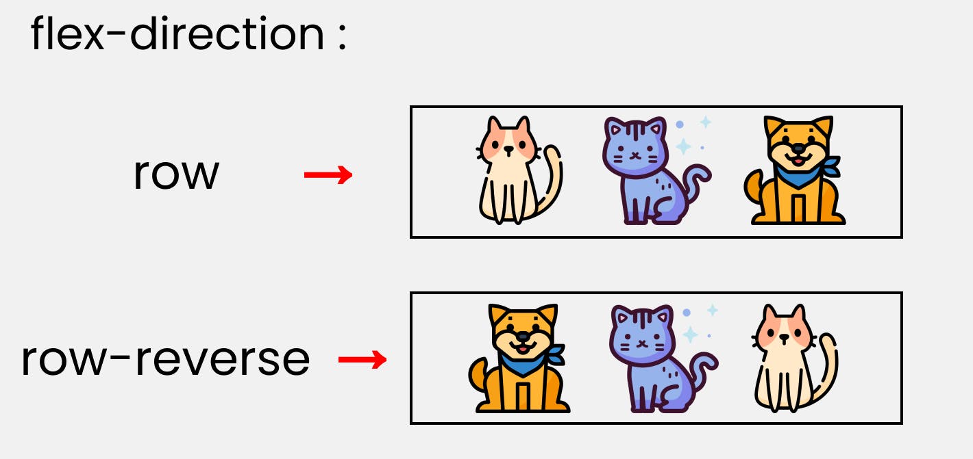
1. flex-direction
This property is for parent. It allows us to set or change item's direction.The Flex-direction property controls the direction in which the flex items are laid along the main axis.
There are 4 methods that you’ll be able to use as the flex-direction.
Syntax:
Row:
.container{ display: flex; flex-direction : row;
}
Row Reverse:
.container{ display: flex; flex-direction : row-reverse;
}
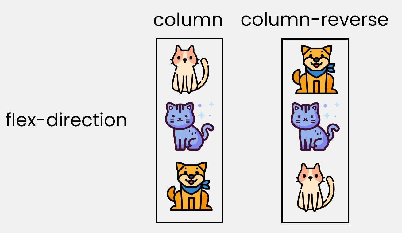
Column Reverse:
.container{display: flex; flex-direction : coloumn-reverse;
}
Column:
.container{ display: flex; flex-direction : coloumn;
}
Please note: that we'll write them inside the .container class.
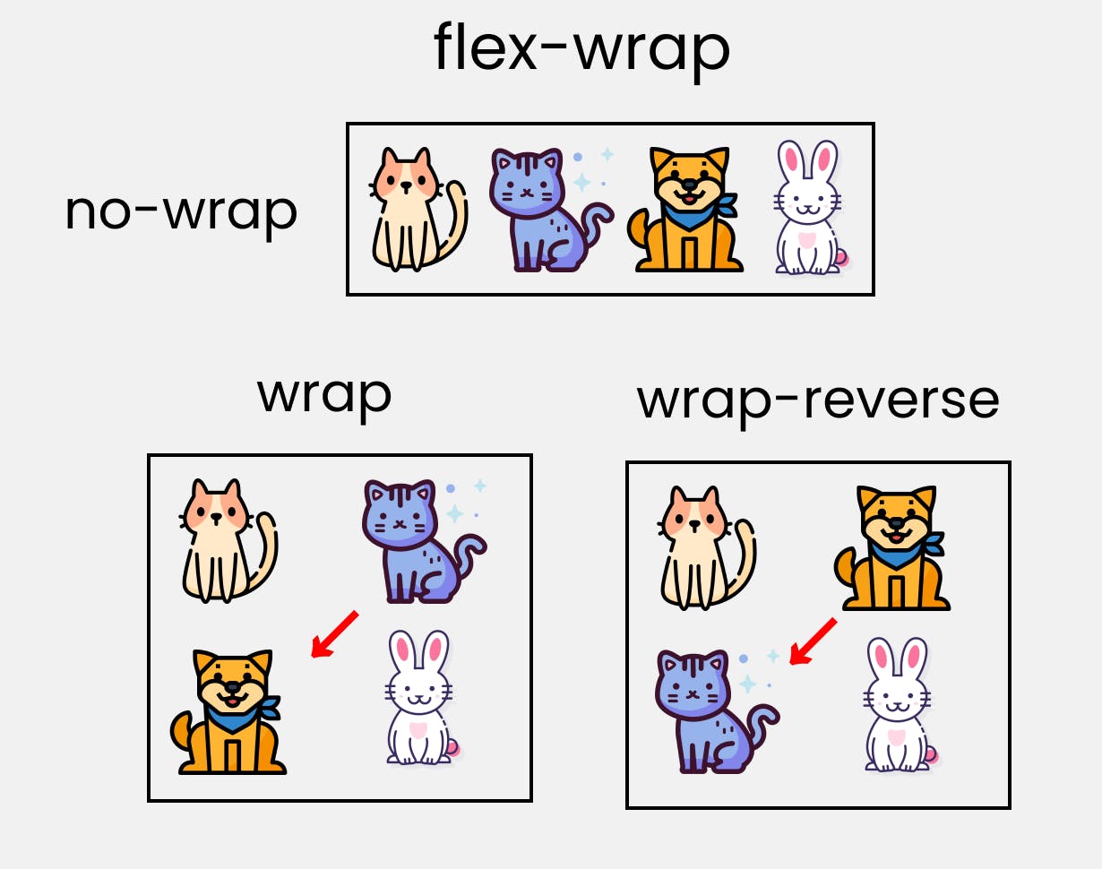
2. flex-wrap
This is also for parent element. It allow you to wrap the items and prevent overflow.The flex-wrap property controls whether the flex container is single-line or multi-line, and the direction of the cross-axis, which determines the direction new lines are stacked in.
For the values that are not wrap-reverse, the cross-start direction is equivalent to either the inline-start or block-start direction of the current writing mode (whichever is in the cross axis) and the cross-end direction is the opposite direction of cross-start. When flex-wrap is wrap-reverse, the cross-start and cross-end directions are swapped.
This property helps you set the number of flex-items you want in a line or row.
Syntax:
Wrap the item (Wrap):
.container{ flex-wrap : wrap; }
Not to wrap the item (wrap-reverse):
.container{ flex-wrap : wrap-reverse; }
3. flex-flow
This is the shorthand for flex-direction and flex-wrap.
Example:
.container{flex-flow: row wrap; }
You can see the first value for this property id flex-direction and second is for flex-wrap.
4. Order
sometime reversing the row and column is not enough , that time we apply order property to individual items. we can use this property to also set it to positive (+)and negative(-) integer value(-2,-1,0,1,2).
Example: order:2;
Alignment
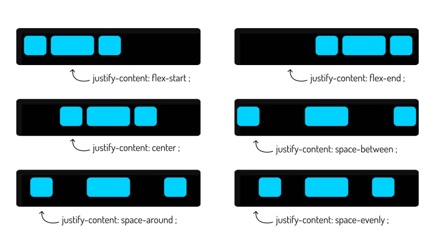
justify-content
distribute extra free space leftover when either all the flex items on a line are inflexible, or are flexible but have reached their maximum size. It also exerts some control over the alignment of items when they overflow the line.justify-content controls where the flex items sit on the main axis. In simpler terms used to align the flex items.
Applies to: flex containers.
Initial: flex-start.
Values
- flex-start (default): items are packed toward the start line
- flex-end: items are packed toward to end line
- center: items are centered along the line
- space-between: items are evenly distributed in the line; first item is on the start line, last item on the end line
- space-around: items are evenly distributed in the line with equal space around them
- space-evenly: items are distributed so that the spacing between any two adjacent alignment subjects, before the first alignment subject, and after the last alignment subject is the same
align-items, align-self
It is also a common and frequently used property. It is used to align items in Y axis or vertical axis. align-items sets the default alignment for all of the flex container’s items, including anonymous flex items. align-self allows this default alignment to be overridden for individual flex items.
value auto
Defers cross-axis alignment control to the value of align-items on the parent box. (This is the initial value of align-self.)
flex-start
The cross-start margin edge of the flex item is placed flush with the cross-start edge of the line.
flex-end
The cross-end margin edge of the flex item is placed flush with the cross-end edge of the line.
center
The flex item’s margin box is centered in the cross axis within the line. (If the cross size of the flex line is less than that of the flex item, it will overflow equally in both directions.)
baseline
The flex item participates in baseline alignment: all participating flex items on the line are aligned such that their baselines align, and the item with the largest distance between its baseline and its cross-start margin edge is placed flush against the cross-start edge of the line.
stretch
If the cross size property of the flex item computes to auto, and neither of the cross-axis margins are auto, the flex item is stretched.
Example:
.flex-container {
  display: flex;
  height: 600px;
  flex-wrap: wrap;
  align-content: space-between;
}
 Take a break...
align-content
The align-content property aligns a flex container’s lines within the flex container when there is extra space in the cross-axis, similar to how justify-content aligns individual items within the main-axis.align-content used to align the flex lines. This is a bit similar to justify-content where justify-content aligns the items on the main axis and align-content aligns the flex rows in the container.
Applies to: multi-line flex containers.
Initial: stretch.
value
- flex-start :Lines are packed toward the start of the flex container
- flex-end : Lines are packed toward the end of the flex container.
- center : Lines are packed toward the center of the flex container.
- space-between :Lines are evenly distributed in the flex container
- space-around :Lines are evenly distributed in the flex container, with half-size spaces on either end.
- stretch:Lines stretch to take up the remaining space.
Example:
.flex-container {
  display: flex;
  height: 600px;
  flex-wrap: wrap;
  align-content: center;
}
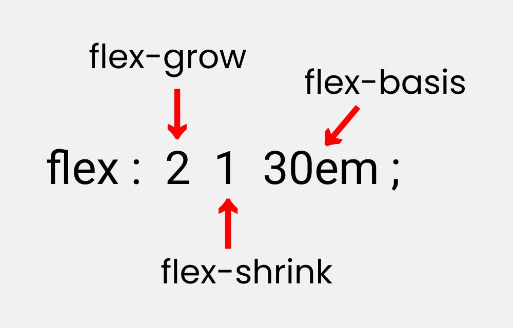
Flexibility
The defining aspect of flex layout is the ability to make the flex items “flex”, altering their width/height to fill the available space in the main dimension. This is done with the flex property. A flex container distributes free space to its items (proportional to their flex grow factor) to fill the container, or shrinks them (proportional to their flex shrink factor) to prevent overflow.
Flex Item Properties
- flex-grow
- flex-shrink
- flex-basis
flex-grow
The flex-grow property sets the flex grow factor to the provided . Negative numbers are invalid.
Applies to: flex items.
Initial: 0.
Value numbers
Example:
.child--featured {
flex-grow: 1;
}
flex-shrink
The flex-shrink property sets the flex shrink factor to the provided . Negative numbers are invalid.
Applies to: flex items.
Initial: 1.
Value
numbers
Example:
.child--featured {
flex-shrink: 1;
}
flex-basis
The flex-basis property sets the flex basis. It accepts the same values as the width and height property, plus content.
Applies to: flex items.
Initial: auto.
Value content | "width"
Done with Flax box hope you enjoyed....