

Photo by Jess Bailey on Unsplash
Do you get confused between flex box and grid 😨 😨?
If you are confused between the flex box and grid or do not know how to use them, then this blog is suitable for you...


Table of contents
- How do we know what is the difference between flexbox and grid?
- Let’s dive into the following underlying principles of CSS Grid:
- 1. Basic CSS Grid principles
- 2. Grid’s terminology
- 3.Using gutters to separate grid cells
- 4.Fractional units
- 5.Column spanning
- 6.Row spanning
- A shorter way to create rows and columns
- Using functions with CSS Grid
- Keywords
- Alignment in CSS Grid
Hello everyone.. by reading the title of the blog you must have understood on what topic this blog is written today. In this blog 2 things can happen to you, you will be able to understand the difference between flexbox and grid or you will be able to revise this topic🤗..

How do we know what is the difference between flexbox and grid?
- grid exactly the same and that is allow you to lay out item flexibly inside of the container but it allow you to do it not in just one dimension but in two dimension it.
- also allow you to line up items within those dimensions both horizontally and vertically just like a flexbox does and is essentially flex box but for two dimension instead of Just One dimension.
- its in incredibly powerful but difficult to wrap your head around due to the complexity of the layout mechanisms we need to take about a little bit of terminology first before we can continue further the first thing that I want to mention is that you have a great container just like you do in a flexbox this container is the object that wrap all of your different grid item shown in below picture.
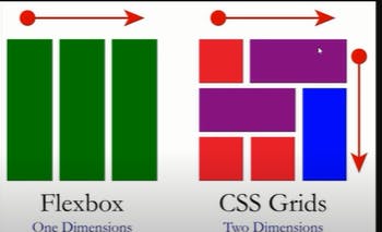
- By looking at the diagram, you must have come to know that what is the main difference between the two.
Now we are going to move on to the main topic of CSS Grid and what are the properties of CSS Grid and what exactly is it used for?
With CSS Grid, we can not only create amazing layouts, but also create responsive web pages seamlessly. Here in lies the power and relevance of the CSS Grid layout system:
being able to use it to design layouts for mobile-first web apps and responsive websites that cut across different browsers.
Let’s dive into the following underlying principles of CSS Grid:
- Basic CSS Grid principles
- Grid’s terminology
- Using gutters to separate grid cells
- Fractional units
- Column spanning
- Row spanning
1. Basic CSS Grid principles
At the most basic level, a CSS Grid is a two-dimensional layout system for the web. With Grid, you can layout content in rows and columns.

But before we go deeper, let’s take a look at the building block of CSS grid, the display: grid; container.
In CSS, we target a HTML element or tag to be styled by first selecting the element and assigning a value to the property to be styled. For example, say you want the color of a
element (or paragraph) to be blue. You can achieve that like so:
- Example:
p{
color: blue;
}
And like the code snippet above, we use the grid value on the display property to tell our parent HTML element that we are about to create a Grid layout.
- Example:
HTML code
<body class="container">
    <div class="item box1"><p>One</p></div>
    <div class="item box2"><p>Two</p></div>
    <div class="item box3"><p>Three</p></div>
</body>
Then, define a Grid layout:
.container{
    display: grid;
}
define or create a grid
Once your grid is defined, you’re in a good position to start, but that doesn’t do anything magical just yet. We need to tell the grid how big the columns and rows should be. To become better acquainted with the details, let’s discuss the terminology of Grid.
2. Grid’s terminology
- Grid Container : The element that establishes the grid and that wraps the grid items.
syntax:
.grid-container {
  display: grid;
}
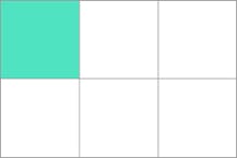
- Grid items: The direct children of your grid container
- Gap: Used to create gutters, the spaces between grid cells, through rows and columns
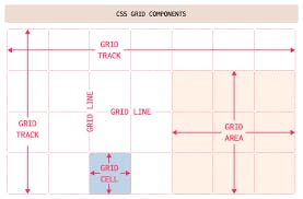
- Grid cell: The space between two adjacent rows and two adjacent column grid lines,the smallest unit you can have on your CSS grid.
- Grid area: One or more grid cells that make up a rectangular area on the grid. Grid areas must be rectangular in nature. specifies a grid item's size and location within a grid by contributing a line, a span, or nothing (automatic) to its grid placement, thereby specifying the edges of its grid area.

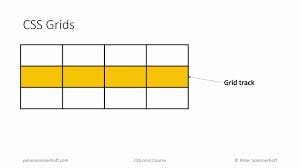
Grid track: Tracks are defined as the space between two adjacent grid line.essentially, the lines that start and stop rows or columns, so you’ll always have one more than the number of columns and rows you have.
Grid Lines: Horizontal and vertical lines that divide the grid.
- please check below diagram you will get more clarity.
Implicit and explicit grid lines: Implicit grid lines are visualized as the dotted lines in your DevTools, and are created by the browser without explicitly defining columns or rows.
Explain implicit grid lines with code:
- Example:
.container{
  display: grid;
  gap: 10px;
  grid-template-columns: 100px 200px;
}
In the code snippet above, we “explicitly” define what the columns will be. We do not define the rows. So, the browser will decide what it will do to the extra items that aren’t covered by the explicit definition. It does this by creating new rows and moving these extra items into the rows. And that’s implicit!
Explicit grid lines are the solid lines visible in the DevTools for rows and columns defined within your CSS. Explicit scenarios aren’t decisions made by the browser; they’re the decisions you make, which are explicit.
3.Using gutters to separate grid cells
Gutters are the spaces between grid cells. You can create a gutter using the gap shorthand property, or you can do so explicitly using
column-gap and row-gap. Should you use the gap shorthand property to create the gutter, the value that you assign to the gap will target both the row and column of the grid.
To provide your grid with gutters using gap, you’ll define this property in the parent container.
- Example:
.parent-container {
    gap: 20px; /* row and column gap */shorthand  property
}

// this can also be written as

.parent-container {
    column-gap: 20px;
    row-gap: 20px;
}

4.Fractional units
fr
The FR value, otherwise known as the fractional unit, solves the problem of automatically distributing free space; it kind of replaces the need for percentages.
Creating CSS Grid containers, columns, and rows Seeing as nothing really happens until you actually define rows and columns, we should now learn how we create them. There are various ways to define each, so let’s begin by learning how to create columns.
The fr unit, also referred to as a flexible length value, is one of the more useful units you can apply to the grid-template-rows and grid-template-columns properties.
As the name implies, the fr unit represents a fraction of any space left over in a grid container.
Creating columns
The grid-template-columns property is created in the parent container where each value passed represents the number of explicit columns. For instance:
.parent-container {
  grid-template-columns: 20px 1fr 40px;
}
The example above tells the browser, “"Create three columns, please! The first column is 20px wide, the second column is 1fr, and the third column is 40px".
You can also pass functions and keywords as values that we’ll address later in this article.
5.Column spanning
The technique known as spanning allows child items to stretch across columns present in your grid by defining column start and column end positions.
- Example:
.child-item:nth-child(1) {
  grid-column: span 2; /* span 2 columns */
}

.child-item:nth-child(2) {
  grid-column 4; /* start item at column 4 */
}
The examples above define each column’s start and end position in a fundamental form, but you can also include a slash between two values. This will produce the same effect as the previous code sample. The difference here only lies in the fact that the first value before the / will target the start line of the column, while the second value will target the end of the grid.
- Example:
.child-item:nth-child(1) {
  grid-column: span 2 / 5;
}
The code above tells the browser, “Span my grid item two columns wide and end it at column five.” This represents the column-start/column-end position, but notice we didn’t tell the browser where to start the column; we only said where to end.
This is something the browser figures out. It says “Ok, you wanna end at the grid line for column five, but also span two columns so your item will actually start at the end of the grid line for column two.”
If we want to tell the browser exactly where to start a child item, we’d leave the span keyword out completely.
.child-item {
  grid-column: 2 / 5;
}
This tells the browser “Start my item at column two and end at column five.”
Creating rows
Grid rows are just like columns, only they run horizontally instead of vertically. The property is written identically to our column counterpart, except we use the word rows instead.
Here’s how that’s written in CSS:
.parent-container {
  grid-template-rows: 1fr 1fr 1fr 1fr;
}
The above example defines four explicit rows, each of which is 1fr high. If any children wrap to a new row, that’s when your implicit rows will be created.
6.Row spanning
With the grid-row shorthand property, we have the same opportunity to span rows just like we can span columns.
- Example:
.child-item {
  grid-row: span 2;
}

.parent-container {
  grid-row: 1 / 5;
}
i.Spanning the full width
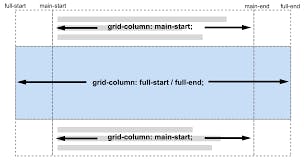
There’s this sneaky -1 value that you’ll use frequently to span the full grid container, and it’s all because your grid is one more than the number of columns/rows defined. It really has to do with tracks. This track officially ends at the end of your grid container.
- Example:
.child-item {
  grid-column: 1 / -1;
}
This example starts at the first column and spans the full width of the defined grid, regardless of the number of columns defined in your CSS.
A shorter way to create rows and columns
The grid-template() shorthand lets you define a start and end position for rows and columns in one line, and is comparatively far easier to read than the grid property we previously discussed. I personally dig this shorthand; it just makes sense to me.
- Example:
.parent-container {
  grid-template: 1fr 1fr / 100px 100px 100px;
}
The shorthands we’re provided with above are grid-template-rows and grid-template-columns, but we also have grid-template-areas to consider, too — more on that shortly.
The first value is the start position and second value is the end position, followed by the slash / that repeats this pattern. You can think of it like this: the part in front of the slash is your rows, the part behind the slash is your columns.
But where are those template areas?
- Example:
grid-template: "header header header" auto
               "sidebar1 content sidebar2" 1fr
               "footer footer footer" auto / 200px 400px 200px;
Here, we define the template areas in the same line as the row size, separated by a slash that defines the number of columns and their corresponding sizes, and all of it is done in one line. Short, simple, and sweet!
Controlling overflow
You can control the overflow of your grid in one swift action using some carefully placed properties for column and row overflow. Let’s start by investigating column overflow.
i.Column overflow
The grid-auto-columns property is one that will help handle your overflow needs. It’s defined on the parent container and is written in the following fashion:
- Example:
.parent-container {
    grid-auto-columns: 2fr;
}
The above code snippet implies that, when an implicit grid is created, the size of the column show take up two fractional units of the parent container.
.parent-container {
    grid-auto-columns: 2fr; /* overflow size */
    grid-auto-flow: column; /* overflow type */
}
The result of the code above tells the overflow to create columns that are 2fr in size, meaning that the implicit overflow will be in the form of columns, not rows.
ii.Row overflow
This property works exactly like our column overflow property and is written the same way
.parent-container {
    grid-auto-rows: 1fr;
}
Just like the property we used for columns, we dictate the size of our implicit rows by passing a value of row to grid-auto-flow. What we get are rows that are created any time an overflow is present.
.parent-container {
    grid-auto-rows: 1fr;
    grid-auto-flow: row;
}
With the above lines, we define the overflow type (rows) and the overflow size (1fr) of the implicit overflow for children elements of the grid container.
iii.Creating template areas
Template areas are nice to use when you don’t have an idea of how many columns you’ll need up front, but they’re also great to use with media queries to achieve some rearranging magic. Here’s how you write the property:
.parent-container {
    grid-template-areas: "sidebar1 content sidebar2";
}
Using a set of quotes containing words of your choosing, such as "sidebar1 content sidebar2", we begin to define our grid areas. You can also define multiple areas. For example:
.parent-container {
    grid-template-areas: “logo nav nav” “sidebar1 content sidebar2”;
}
This property alleviates the need to worry about line numbers, and each one used will be positioned accordingly. You set the position by defining the property on a child item of your choosing.
.child-item:nth-child(1) {
    grid-area: logo;
}

.child-item:nth-child(2) {
    grid-area: nav;
}

.child-item:nth-child(3) {
    grid-area: sidebar1;
}

.child-item:nth-child(4) {
    grid-area: content;
}

.child-item:nth-child(5) {
    grid-area: sidebar2;
}
Using grid-area, we pass the corresponding area as a value. Nothing more, nothing less; it’s that straightforward.
Named grid lines
This particular feature of Grid, named grid lines, might be useful if you want to explicitly direct your layout behavior. You are granted the ability to name positions on your grid instead of using nameless numerical values.
Named grid lines example:
.parent-container {
    grid-template-columns: [nav-start] 150px [main-start] 1fr [last];
    grid-template-rows: [header-start] 50px [main-start] 1fr [footer-start] 50px [last];
}
The region is given a name followed by the size (constraint). To define the position, we turn to child items, where we’ll define the value based on the named regions above.
.child-item:nth-child(1) {
    grid-column: nav-start / last;
}

.child-item:nth-child(2) {
    grid-row: header-start / main-start;
}
Using functions with CSS Grid
These handy little devils are the helping hands for your grid desires. They’re the superstars that help make your code-writing life easier and far more efficient. Let’s start with one of my favorites: repeat().
I.repeat()
The repeat () function allows recurring patterns to be written in a succinct fashion — one you’ll use quite a bit when it comes to Grid. We define how many rows or columns we desire followed by a constraint, but you can also pass other functions or keywords as arguments, too.
- Example:
.parent-container {
    grid-template-columns: repeat(4, 1fr);
}
Here’s an example of repeat() in action to create four columns that are 1fr wide, but you can also create repeating patterns.
.parent-container {
    grid-template-columns: repeat(2, 80px 1fr) 250px;
}
In this example, the pattern repeats twice. The first column is 80px wide, and the next column is 1fr. The pattern is repeated once more and concludes with the final column set at 250px wide.
II.fit-content()
The fit-content() property does one thing: it clamps a value to a given size passed.
fit-content(100px) You’ll mostly use it with grid-template-columns and grid-template-row.
- Example:
.parent-container {
  grid-template-columns: fit-content(100px) fit-content(150px);
}
III.minmax()
The minmax() function defines a range between a set of values that functions as — you guessed it — a minimum and maximum constraint, and writing it is a breeze.
minmax(30px, 200px) When content breaks column bounds, this function can be used inside repeat().
- Example:
.parent-container {
    grid-template-columns: repeat(auto-fill, minmax(250px, 1fr))
}
If you want your children to wrap like champs, this is the way to go — especially when more elements will be added dynamically.
Keywords
Keywords are extremely valuable to your arsenal, so you’ll wanna get familiar with them, or at the very least know they exist. Let’s start with the ones you’ll most likely use and certainly the most confusing: auto-fit and auto-fill.
1.auto-fill / auto-fit
The auto-fill keyword ends the grid on the explicit grid line and fills all the available space. It also stretches items inside the grid’s tracks to fit. This makes it a very worthy approach for wrapping elements when combined with minmax().
The auto-fit keyword ends the grid at the explicit column line. This is the opposite of what auto-fill does, as it also expands the explicit grid.
You can use this keyword within the repeat() function.
Example:
repeat(auto-fill, 250px)
Since the above doesn’t explicitly state how many columns are desired, extra implicit grids or columns will be added. This is the equivalent of telling the browser to “just figure it out,” and chops the grid into as many spaces as it can that fills up the available space. If you’d like, you can read more about auto-fill and auto-fit for further insight into these keywords.
Using the value dense will make the grid auto-fill spaces in the grid container. This will also help create space for other, smaller grid items that may come up later.
When used in this fashion, grid-auto-flow: dense will place items without creating remainder areas and wiggle in additional ones that fit. In other words, it packs items in without leaving unused space behind.
- Example:
If you don’t care about order and just want all spaces filled, this is a good option.grid-auto-flow: column dense; grid-auto-flow: dense;
Alignment in CSS Grid
Flexbox is well-known for making it easy to align items, but you can do it with Grid too. The same properties available in Flexbox are also available with Grid such as:
- align-items
- align-self
- justify-self
- justify-items
- justify-content
Think of justify as being along the row axis (left to right) and align along the column axis (top to bottom). For a deeper dive, there’s a great breakdown of how each of these works on CSS Tricks.
There’s also a powerful property called place-items that aligns items horizontally or vertically in one line:
place-items: x | y;
place-items: center center
Typically these alignment properties are defined on the parent container, but they can also be overridden on the children as well.
Order
Grid has an order property exactly like Flexbox’s to control the arrangement of items. It is written in the same fashion.
- Example:
<div class="container">
    <div class="sidebar"></div>
    <div class="content"></div>
</div>
Then, in your CSS:

.container {
    display: grid;
}

.sidebar {
    order: 2;
}

.content {
    order: 1;
}

If passion drives you, let reason hold the reins.
I end the blog here, I hope everyone enjoyed while reading.